Case Study: Roberta (Bobbi) Kline
In this blog I’m going to show you brand archetypes examples in action with my client Bobbi Kline.
Bobbi is a registered ObGyn and Genomic Medicine practitioner and trainer as well as a soon to be certified Human Design Practitioner.
Bobbi came to me for an Astrologically Aligned Branding Session feeling like no brand designer had ever truly “got” her. Her Capricorn Sovereign Archetype had always come through strongly but something was missing.
Discover more about your Sun Archetype by downloading my free astrobranding guide below
Step 1: Discovering her Astrologically Aligned Branding Signature
The first thing we realise in our Astrologically Aligned Branding session was that whilst Bobbi has strong Capricorn or Sovereign archetypes she also has a strong Cancer or Caretaker Archetype as well as a Leo or Creator archetype energy yet her previous branding was not bringing this through.
At the conclusion of our first session I presented her with this mood board integrating the brand archetype examples of the Creator, The Sovereign and the Caretaker.
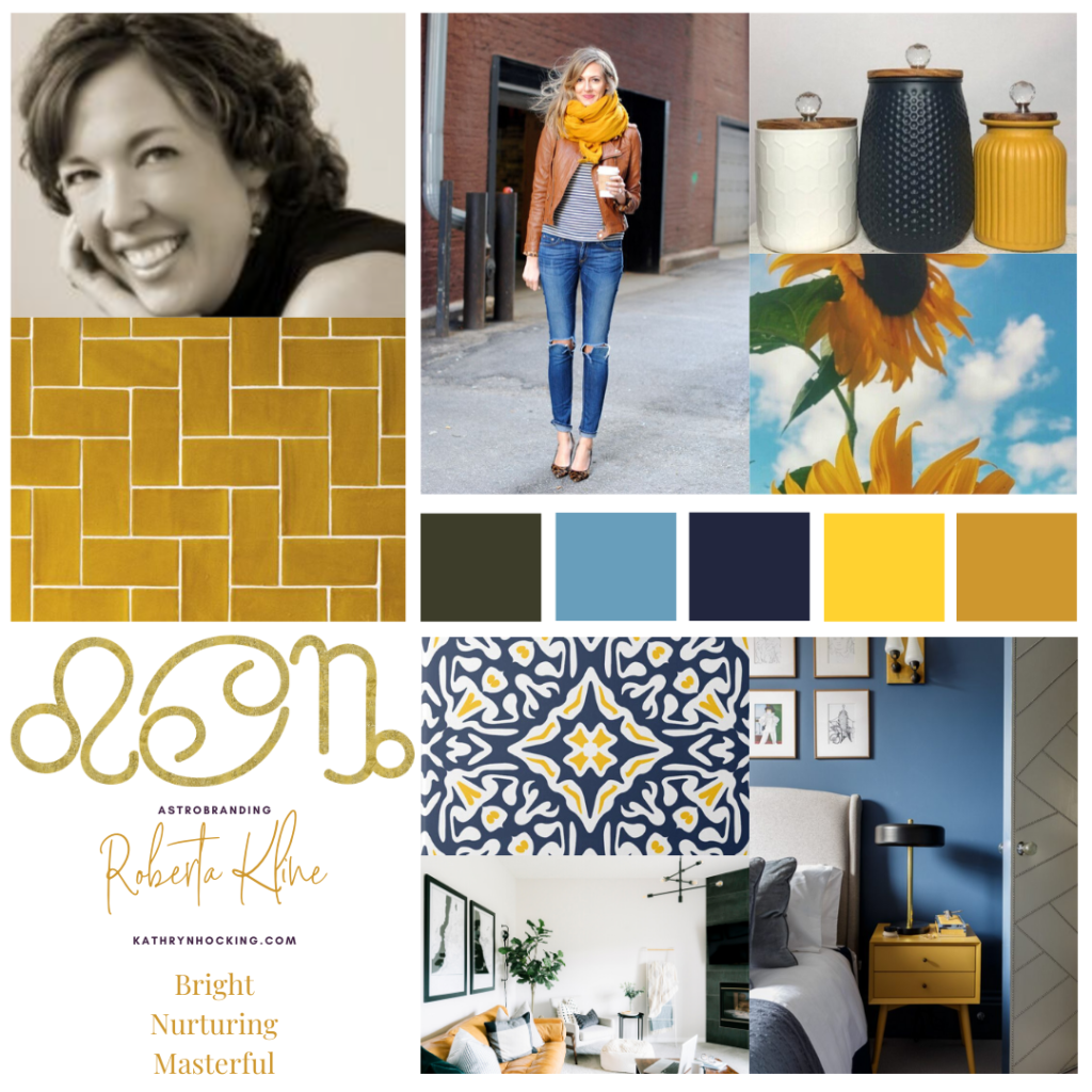
We both loved it and Bobbi decided to sign-up with me to do a full brand identity. It’s important to note that this was just the first step in the process.
Funnily enough, I picked her favorite flower – a sunflower for this mood board.
Step 2: Brand Workbook
The next step for Bobbi was to complete my brand workbook to give me a deeper insight into her brand, her goals, her future offerings and how she wants to show up in the world.
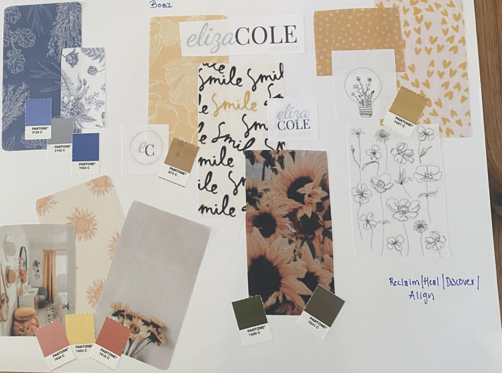
Whilst she was working on this, I started on a tactile mood board to channel my inspiration for her brand. A number of concepts from this mood board ended up in the final design.
Step 3: Creative Brief
The next step was for me to come up with a Creative Brief. This is basically a summary of how I see Bobbi’s brand and a revised mood board that captures her essence.
Bobbi’s Astrobrand of Capricorn-Cancer-Leo needed to bring together professionalism and expertise, nurturing and femininity as well as a bright and fun vibe.
During this process I came up with the “tagline” which Bobbi loves and which perfectly sums up her work:
Reclaim|Heal|Discover|Align
This mood board brought in more of the Cancer Archetype and brought a needed softness to the brand.
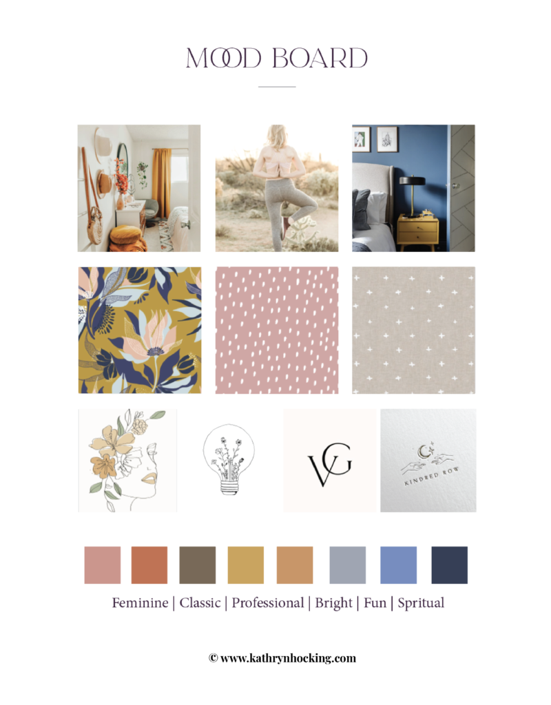
Bobbi loved the direction I was heading and provided me some feedback from which we settled on for the brief:
Simple Minimalist Text Based Logo
Tagline: Reclaim | Heal | Discover | Align
Icons: Hummingbird or Sunflower
Brand Colours: Prefer a peach, lighter pink
Pen & Ink Illustrations
Step 4: Creating the Brand Concept
I went away and was immediately inspired creating 90% of the brand in the next couple of days and then refining over the next week.
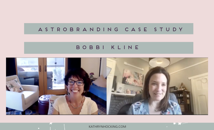
I feel like together we channelled a truly beautiful and aligned brand. Watch the video below as I take Bobi along our journey and we see her reaction to my final brand concept.
Step 5: Feedback and Brand Handover
After the brand presentation Bobi provided feedback including having logo options with her “MD” title as well as a “Dr. Bobbi” informal logo.
We also made a few changes to the brand patterns. Easy peasy!
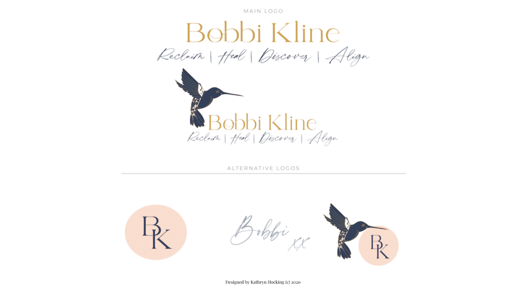
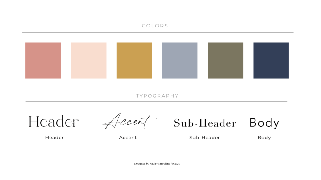
You can see her final brand elements below.
Logos & Submarks
Colour Palette & Typography
Patterns & Illustrations
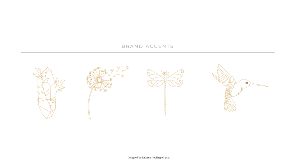
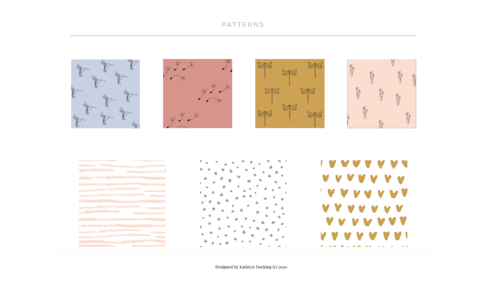
The final part of the process is finalising all the design files, handing them over in adobe illustrator and png files and providing a PDF brand guide that details how to apply the brand correctly.
I’ll also be designing some additional collateral for Bobbi such as social media graphics, blog graphics, email header and presentation templates.
Do you want to discover your Astrologically Aligned Branding Signature?
Check out my Your AstroBrand Map course and get started on your journey to a soul-aligned brand.
